Honolulu Museum of Art
Member Magazine Art Direction & Design
Intro
The Honolulu Museum of Art opened its doors in 1927 to the public, and has since become a gathering place where art, education, film, and community converge in two historic buildings. It is the largest of its kind in Hawaii, with a remarkable collection of over 50,000 works of art spanning 5,000 years from countries and cultures across the globe.
Overview
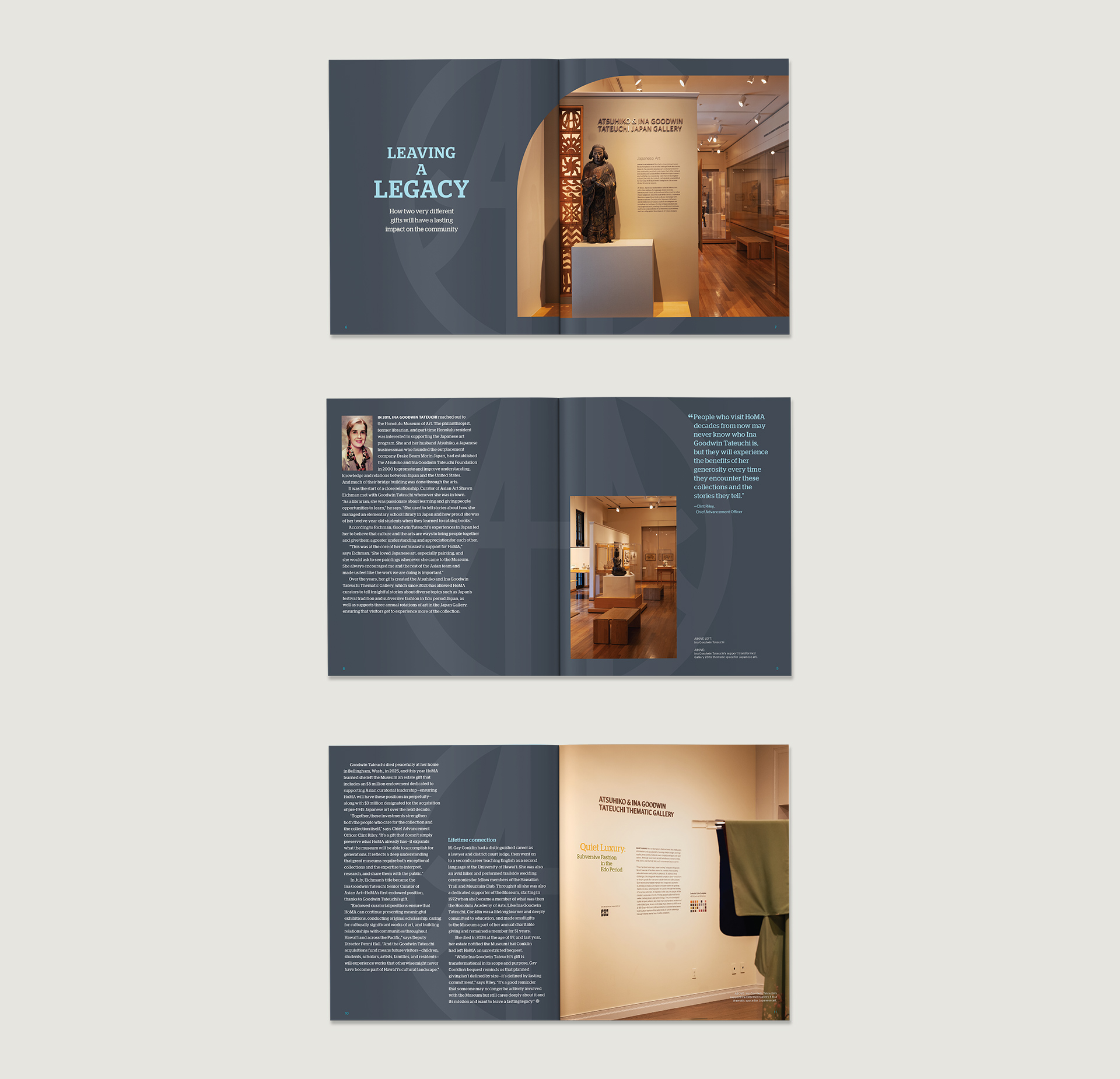
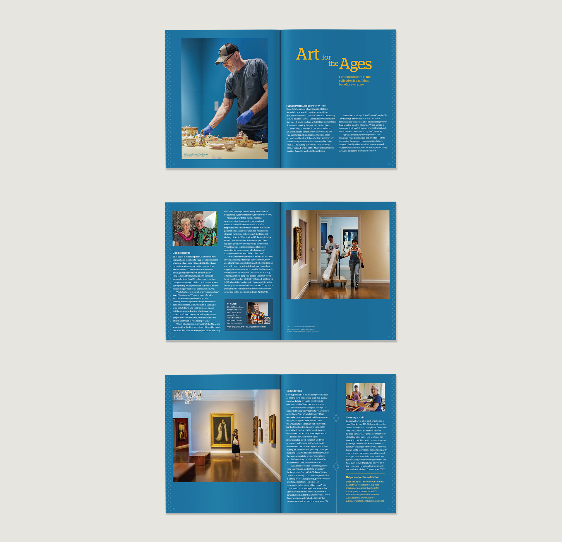
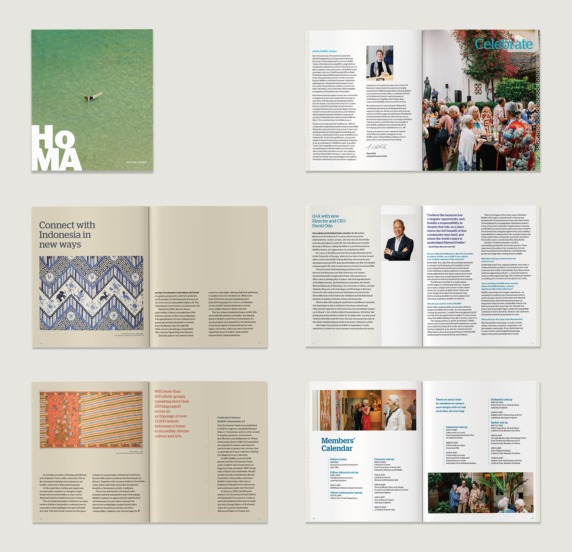
In preparation for its centennial celebration, the museum wanted to re-conceptualize the member magazine. Instead of functioning primarily as a bulletin of upcoming events, the goal was to emphasize legacy and encourage patronage through storytelling, while maintaining a contemporary and polished aesthetic.
I worked with editor Lesa Griffith to redesign the member magazine from a quarterly issue to a lengthier bi-annual issue. Due to a tight deadline, I kept some of the older design elements (e.g., font family Stag and Stag Sans, page size, paper type, and front cover design). At 48 pages, the design shifted from a 10-column grid to a 12-column grid to adjust to multiple spreads and larger body text font sizes for better readability. In addition, I contributed photography and photo retouching.
Graphic Elements
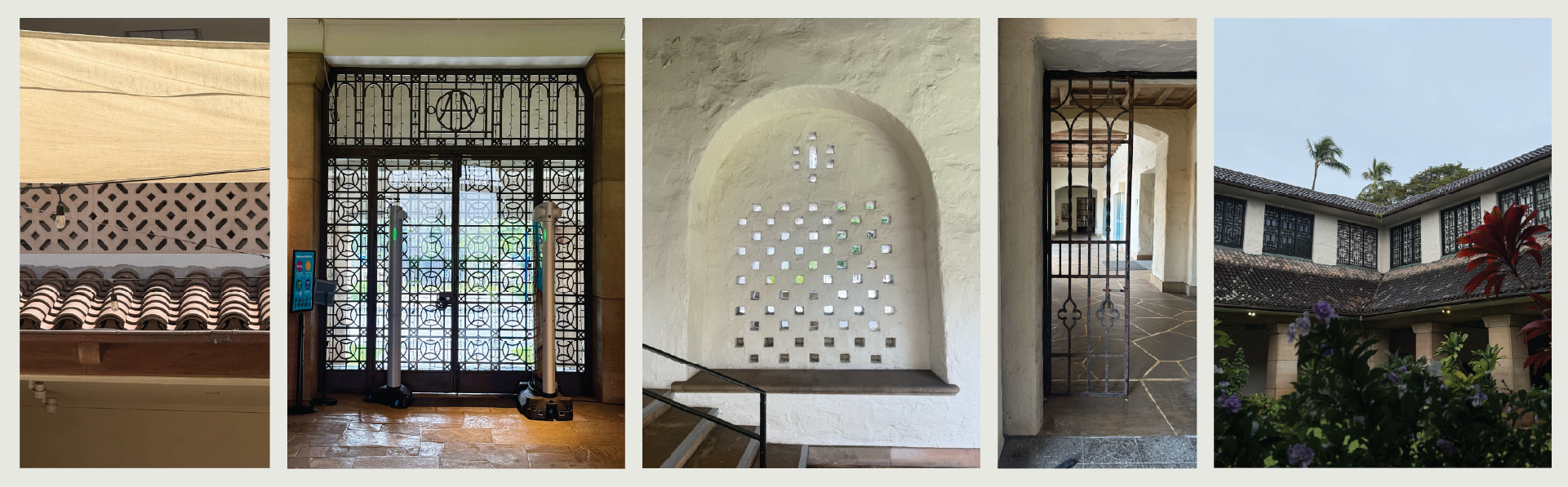
The magazine incorporates subtle patterns found in the museum's "Hawaiian" architecture of the 1920s and 1930s. Designed by New York architect Bertram Goodhue, the museum is now a historic site, showcasing a combination of Chinese, Spanish and island design. I wanted to emphasize the materiality and history of such a unique, beautiful place by referencing its textured stone walls, iron gates, themed courtyards, arches, and high pitched tile roof.
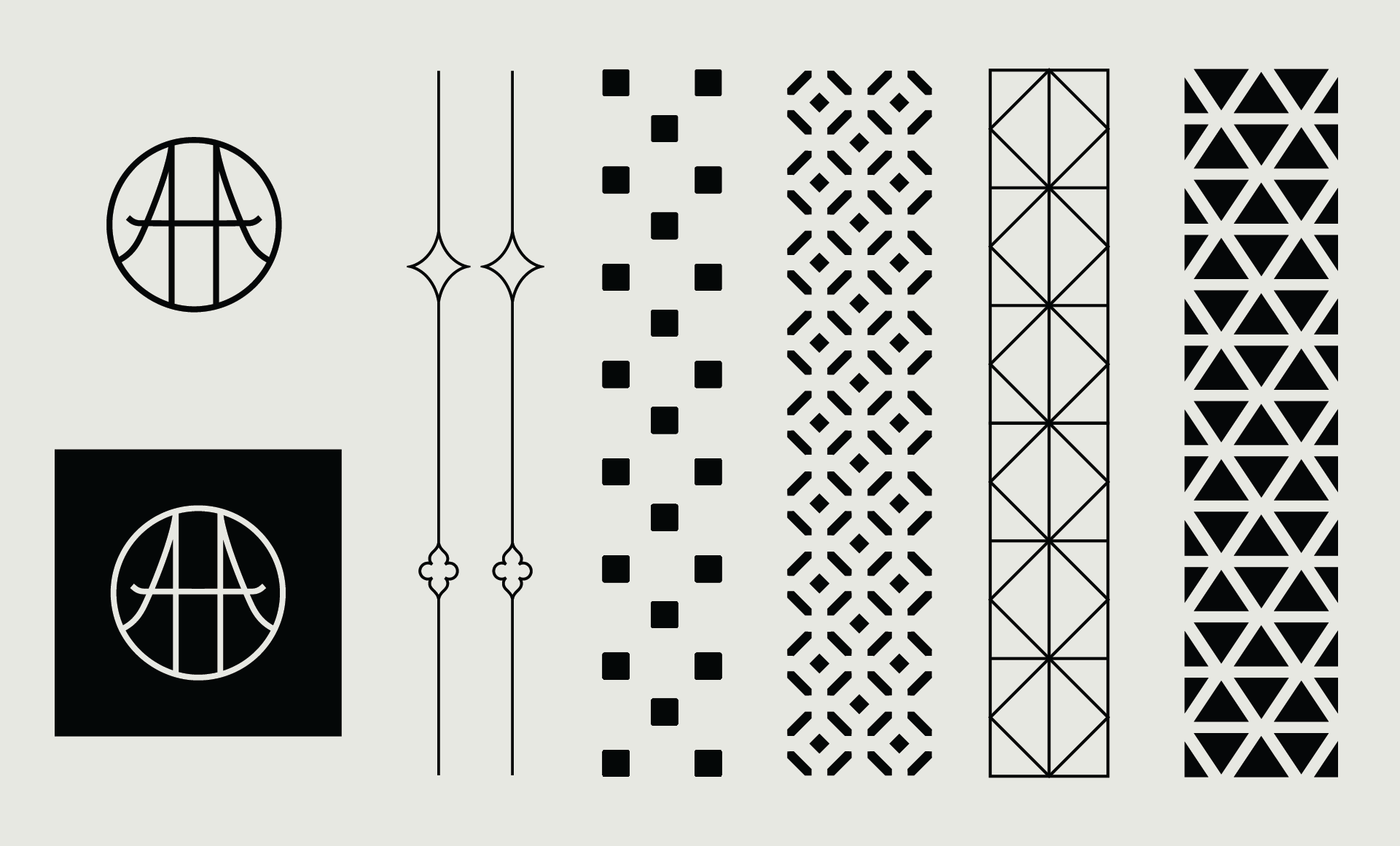
Architectural patterns: Several spreads feature graphic patterns from buildings on the left and right margins.
Custom dingbat : A custom "AA" dingbat was designed from a symbol found at the museum's entrance gate. This references the "Honolulu Academy of Arts", which the museum was initially known as until its name was officially changed in 2012.