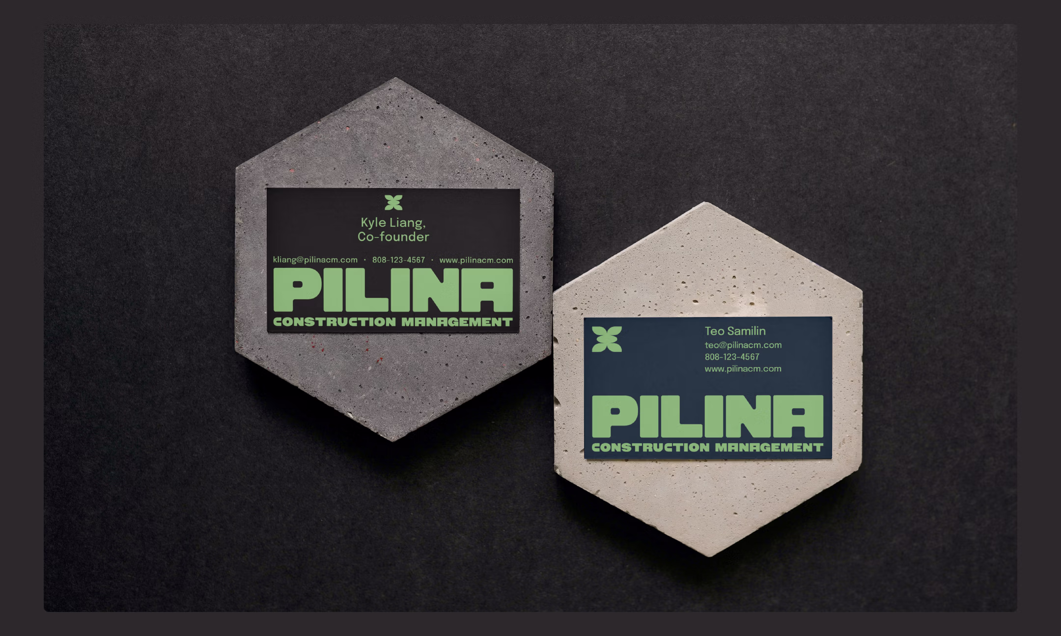
Logomark
The logomark is a simple, bold representation of the maile lei, symbolizing peace and unity. It has deep cultural significance, and encapsulates the essence of Pilina.
Breezeblocks: The logomark was also inspired by breezeblocks, a familiar architectural element in Hawaii's urban landscape.
Ti-leaf: The open ti-leaf ends make up the four corners of the logomark, while an oval in the middle represents the inseperable, harmonious relationships between Pilina and their project partners.
Logotype
The logotype is derived from the Owners XWide XBlack typeface, an expressive family of fonts that takes inspiration from the dynamic energy
of handmade signage.
It is sturdy and rugged, reminiscent of foundational building blocks.
Like the leaves on the logomark, the corners on all letterforms are slightly rounded to add a touch of softness.
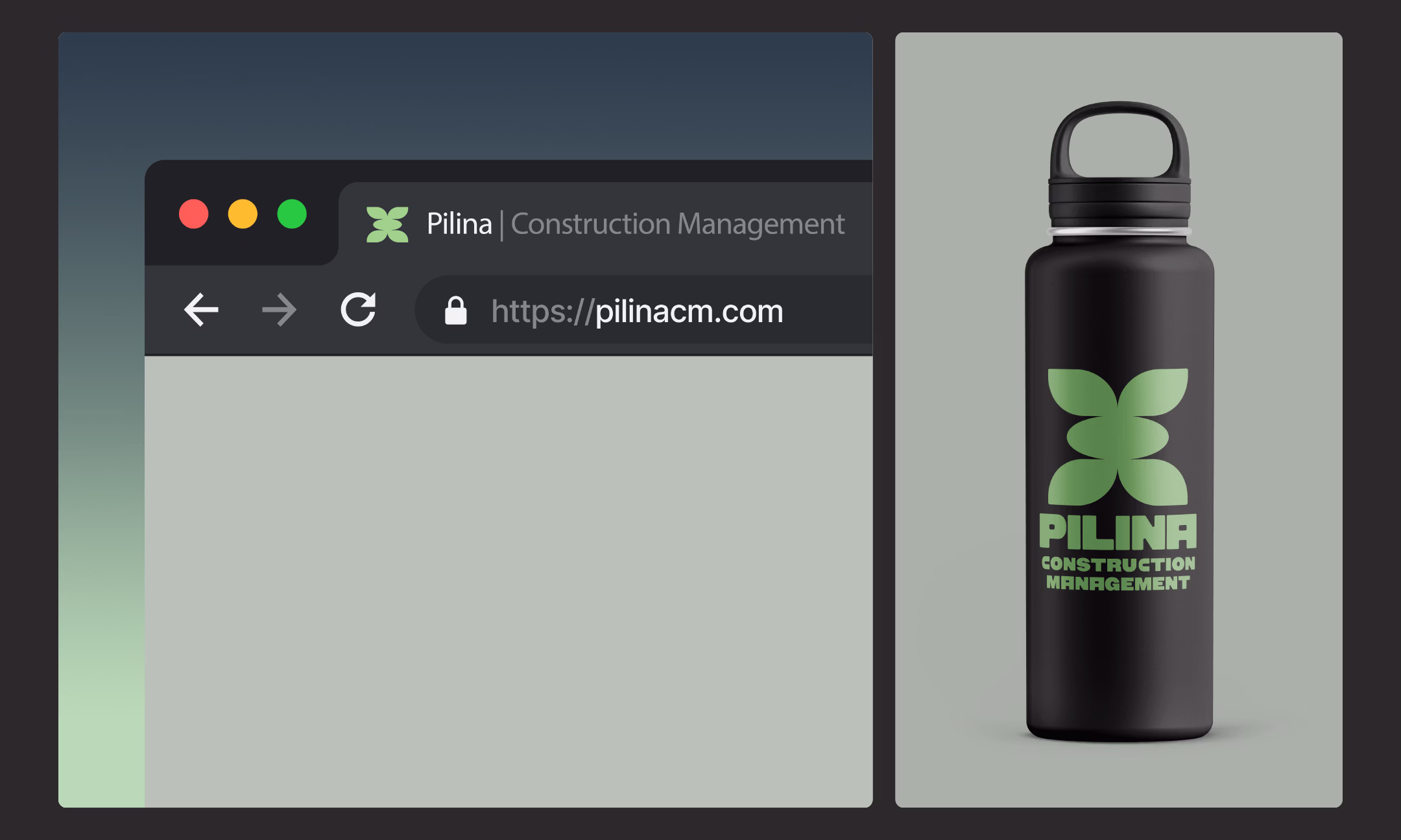
Colors
Pilina’s brand colors are equally inspired by the natural environment and building materials. Together, they are grounded, modern, and confident.
Basalt Black: Like the volcanic stone that has shaped the Hawaiian islands, this color embodies strength, permanence, and deep-rooted trust.
New Growth Green: Vibrant and energizing, this fresh green hue represents the maile lei and can be used as an accents.y
Steel Blue: Represents Pilina's integrity, professionalism, and precision.
Concrete: A clean, neutral tone to calmly round out the palette.
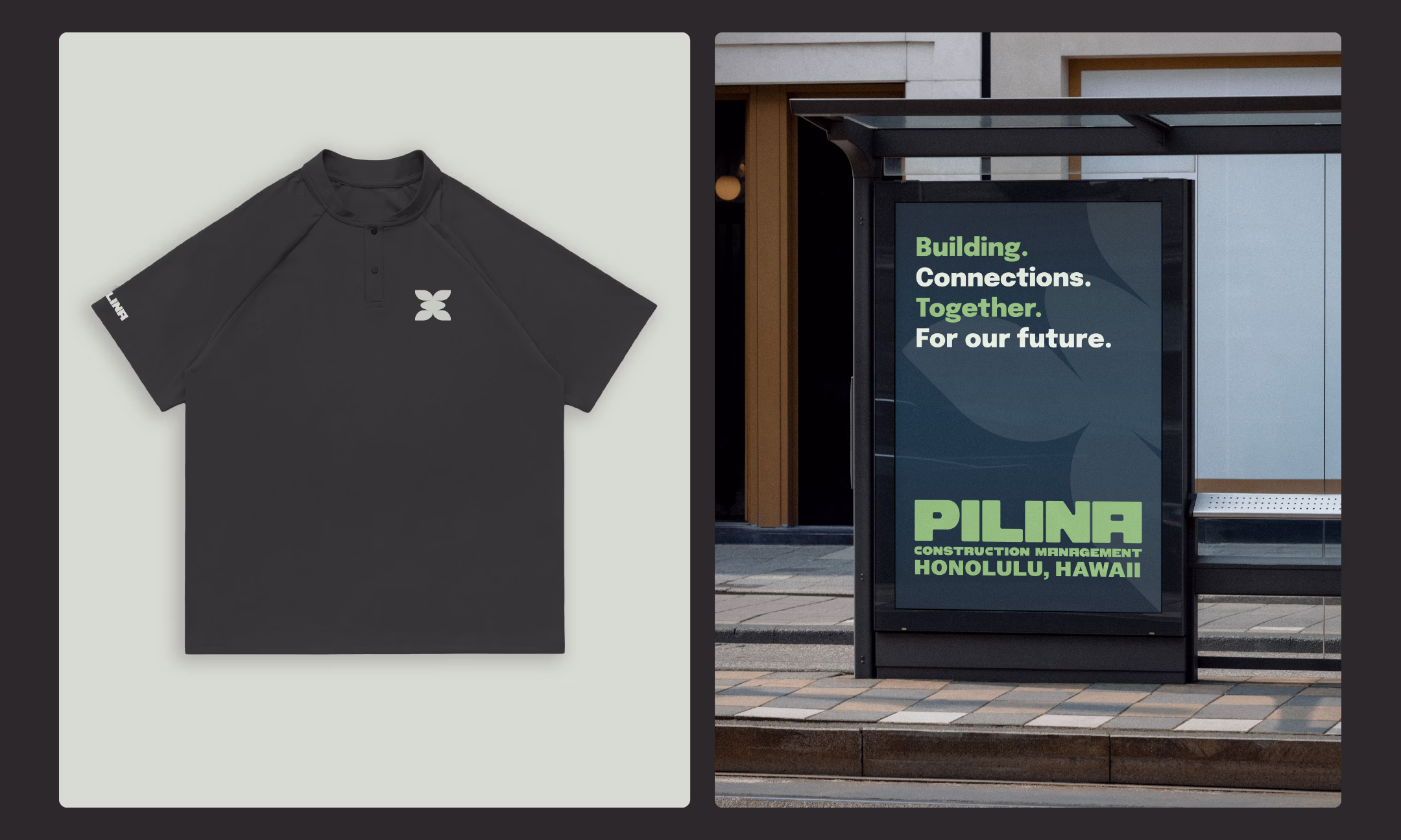
Typography
Epilogue is a versatile geometric sans serif that balances modern precision with warmth. Clean, crisp and memorable, this typeface is available in 8 weights and italics, making it versatile for both print and digital applications.
For smaller text, in annotations, the medium weight is recommended. For all others, regular weight is recommended.